Monday 20 December 2010

Recycling posters...


Conclusion

After doing my reviews on the posters below i have been able to find out what looks good and bad for a poster design. Also after looking at the posters i already have some idea of what i would like to do.


I chose this because the project will be based on electronic waste, so i wanted to look at posters that are already out there. I don't really like this poster that much because it is very boring, there is too much text to read so it makes me think i cant be bothered to read it. Its got very boring colours on it, i also think the font is average nothing special. I think if i was to use anything useful from this poster it would be not to use as much text and use a bit more colour.

Recycling poster...


The main reason i chose this is because it is simple and it gets the message across, The only bad thing about this poster is that its only got two colours in it, even though it uses the main recycling colours, it is boring and people wont look at it.  If i were to use anything from this poster it would probably be the simple layout.

recycling posters...


I like this poster because of all the bright colours used, I think the green banner across the bottom looks really good and is really effective cause it will catch peoples attention and make them want to read on or look at it more closely. In my own work i would probably not use as many colours as this one has got, but the idea of the banner across the bottom of the page is good idea.

recycling posters...


While on google images i came past these two posters, they were done by an artist called Hermosa, who can be found on http://www.deviantart.com/
I really like these particular posters because they look cartoon and quirky, i also like the fact that there not boring to look at because of all the colours that have been used, i also think the ticks and cross are a good idea for the purpose of the poster.... I like the different fonts that have been used but i wouldn't use this idea in my own work because i want to make sure that my work looks professional, where has i think these may have been used for little children to help encourage them to recycle. Its not only the font that makes me think this its also the eyes on each of the images. 

Project proposual...

The Chesterfield Borough Council are piloting a new recycling scheme aimed at small electrical goods such has, Hair dyers and straighteners, because of the worrying figure that only 15-20% of electronic waste gets recycled. At the moment there are not a lot of places where you can recycle these things. So the council are thinking about putting recycling banks in car parks, and at supermarkets etc. The main aim to this project is to create a poster that will encourage the public to use the new recycling banks for the electrical goods, instead of them just going to the land fill sites.
   For this project I aim to do some research on Recycling and also on existing recycling posters, of the old and contemporary looks to the posters and on the artist who as designed them to see if i can get a bit of inspiration. Some of the artists being Sam Kirk, Hebru Brantley and Hugo Style, these particular artists work on recyclable goods. I will also be looking at colour themes and what things would persuade the public to actually start to recycle their electrical goods.
    I will also be experimenting with different medias and materials such as mono prints, Collograpgh prints, Layering different materials on each other, as well as looking at different types and type sizes that are most effective. I also think i will come up with a a catchy slogan to help encourage the public. I will be making sure that the poster looks professional that it catches peoples attention.

Monday 13 December 2010

Evaluation for blog project...

During the past five weeks i have been creating my own blog, while doing this project i have learnt the advantages to blogging. Them being that it does help to broaden your influences and information, cause of there being a blog for pretty much anything. I also like the fact that it is easy and simple to show other people own work and the things i like, i also like that maybe by other people looking at what i have looked at will be influenced to. Another advantage to blogging is that it is simple and quick to set up, which meant i could start posting straight away. Its also goo d because even though your own work might not look that good, having a blog makes your work look more professional and it also helps to build a portfolio.
         However in some people opinion, being able to create a blog that easy and that anyone can do, isn't fair on the people who are really good and are professionals. They see it has because there have worked hard and that it should be appreciated, by not letting just anyone post there own work on the blog. sometimes the blog decides to have a mind of its own and sometimes high lights text and images so you accidental delete them, sometimes the fonts sizes seem to change.
   While doing this project Ive learnt many new skills that i can do like making new posts, what layouts and fonts look good because of researching dyslexia. Ive also learnt how to set up the actually blog and also how to use the google reader. Ive also learnt ho to follow other peoples blogs.
     Overall blogging has its advantages and its disadvantages, but personally i like it, i find it easy and fun to follow people and find things that i like. 
  

Just cause i like it.....

Im not really sure what this piece of work is used for, or who it is by. The main reason i like this piece is that it is colourful and differen, i also like the way it looks kinda weird... and that there both bit like montages.

Just cause i like it.....

Whille looking through a magzine i noticed this advertisement for pointer footwear. I really like this because it looks quirky and fun. I like the bright colours in it, i also like that it looks weird... and that its just a bit random.

Julie Verhoeven


While looking through a graphics design magazine called Grafik... i came across the illustrator called Julie Verhoeven.  I really like this particular piece of work (above) because it looks a bit like a doodle as well as a montage in one. Most of Julie's work looks interesting, has thou she has been very free with what ever media she is using. I also like the slight quirkiness to her work.

Dooooodle...

Seem has one of my projects is based on doodles, I had to do research on images of doodles on the Internet i cam across this particular doodle. I really like this doodle because there not boring and that there is alot to look at. I also like the way they put hand drawn typography into it.


Album cover...

Seem has i am studing graphic design im always on lthe look out for things to influence me... While on google images i came across this Micheal Jackson album cover... I like this cause its a photomontage, and i like how all the images are layerd on top of each other. This particular piece of ablum work is very good because it ties into one of my current projects. 


Sunday 12 December 2010

My own work - Doodle Project


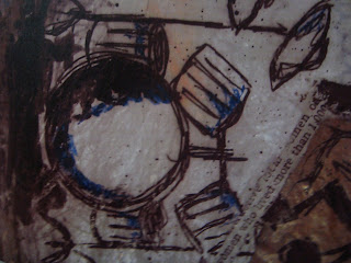
Above is another on of my final pieces for the doodle project. I only really like certain parts of this piece because i think as a whole piece it not very detailed and there are a lot of white spaces in it. Just like the one before i used ink using sticks and brushes, i also used the letter blocks again because i thought they looked effective from the piece of work before. Also has before i used newspaper to add detail and make it look interesting to look at.


Above and below are close ups of the parts of the piece that i liked...


My own work - Doodle Project


One of my projects was based on doodles... above is one of my final pieces.
I like this piece of work because of all the different materials and media's i have used. I also like that you can see the colored ink through the tissue paper because this makes it interesting to look at. Ive also used bits of newspaper and brown paper to add more effect and make it look more detailed. As well has using sticks to apply the ink i used letter blocks and paintbrushes.


Above and below is some close ups of the final piece at the top....